the graphic design ramble
 we tear apart graphic design! not really but i would like to discuss on a specific type of graphic design that ive seen, particularly in things made around the 1950's to the 1970's. i have no idea if this type of graphic design even has a name or if it even is a concrete style or not, im not an expert im some guy sitting in a chair writing this stuff because of moral obligations and because my handwriting is terrible, rendering a journal useless. anyways, thats the topic.
holy crap!!! opinions!!!! (yes this stuff does generally reflect my opinion. if i criticize a style of something or praise another, do note that i dont mean ill will and that at the end of it, people like what they like and unless if it is illegal, im not one to judge)
act one: cool fun examples of posters
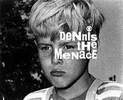
 now it is necessary to provide examples for this type, as simply using words is a kind of shabby way of talking about something visual. unfortunately, there is only so much space before you have to scroll a meter just to get through the stuff i would put, so to meet halfway with the issue, i will provide other examples via namedropping them in parentheses. to start, we need to talk about the posters made by saul bass. looking at the poster provided at a glance, you can immediately see that there is a lot of empty room on the poster. the poster is by no means deserted, in fact it is quite occupied with things. what i mean by empty room is that there is a lot of potential for other things to be placed, kind of like the article you are reading (the empty space was intentional i swear), but muddling the poster with more things would only serve to make it feel cluttered and ugly. there are plenty of posters out there that do the contrary to this one and fill it to the brim with every single character in the movie, dead or alive they make on to the poster. this may seem like a good idea and it could be executed well (although it doesnt quite fit the bill, i think justice leauge [2017] kind of fits what im going for here), but ive seen more flops of this type than sucesses, so i generally wouldnt regard it as a type of design that im too fond of. "but then how do you explain this poster?", you may ask. the thing with the anatomy of a murder poster is that it takes a simple approach in the way it fills the blank space. imagine this, you have a whiteboard that you need to fill with something, you can fill it with anything, whether it be uncolored shapes or words or drawings, it does not matter. now imagine one white board just divided into four blank squares. that is one valid way to fill the whiteboard. next to it there is another whiteboard, but this one is filled with words, top to bottom and left to right. this is also another valid way to fill the whiteboard. although both of those methods were valid ways to fill the whiteboard, both of them are not very pleasing. one whiteboard is almost completely empty and the other is almost completely covered in marker ink. so what would be the best way to fill this whiteboard?
act two: the method
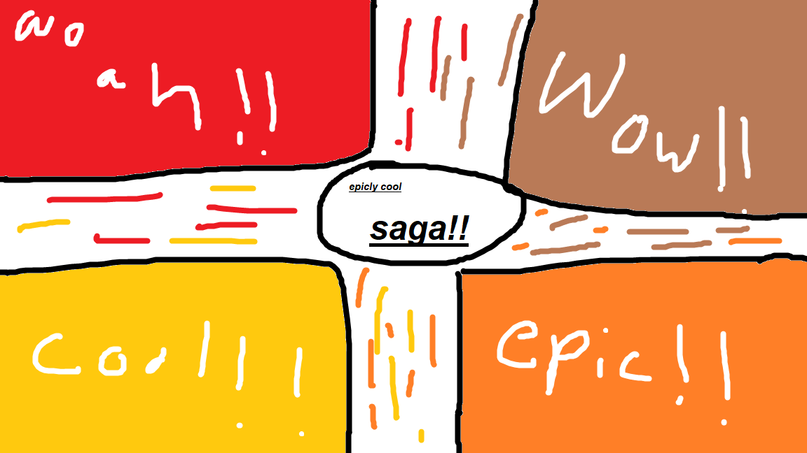 now this isnt the best example of what im talking about but ill just state what im talking about now. use both methods, but slightly alter them. you could divide the whiteboard into four squares like the super empty one, but then fill those squares with colors and add silhouettes and stuff, but keep the areas outside of the squares blank (like i ignored, do as i say, not as i do). for the final touch, add a logo or something in the middle, preferrably simple to counter act the stuff happening on the other sides. once that is done then you have successfully pulled off a passable poster. once again, my example is not the best as i forgot some rules and it is made in ms paint with the incorrect aspect ratio, but i kind of needed something within five minutes and this is the best that i could do. now there is more stuff that i could talk about like which colors match with which, shape variation, and other stuff, but im trying to keep this not that boring, as i need to move on to another segment.
act three: the simpler stuff
 when discussing about the design that goes behind stuff that you see, logos need to be talked about. this was already touched upon briefly when we were talking about the poster, but logos tend to have enough nuance to warrant its own section in this little talk, so it will get that. the general point of logos is to represent the brand in almost the least amount of stuff possible, which seems to be the principle nowdays. logos have always been simplifying to some degree but the simplification process seems to have ramped up recently. im not saying that im not a proponent to the simplification of logos but i do have to say that some companies seem to be going overboard on the whole thing. some logos have been simplifying so hard that they just become [name of company, arial font, bold (if you are feeling daring), 14px]. now text logos are fine enough (old microsoft logo circa 2000's) but the recent ones that have been popping up feel a bit lazy. similar to how movie posters are, i feel like a sort of complex simplicity should be strived for when creating logos, stuff should not be text or a circle with only one color in between but your logo also should not be a full drawing of your office with shading and colors and the one piss bush in the parking lot highlighted. what i mean by complex simplicity in this case is something small but eyecatching, something that can refer to the product's or brand's identity (super famicom logo). these logos are recognizable for those who are familiar with the brand and their products but distinct enough for people not familiar with the brand to tell the difference between it and another unrelated logo. the issue with plain text is that it does represent the brand by stating the name of it but it visually is not that distinct from other logos that take a similar approach, in the end blending the logo together with the others. maybe this might a problem that i only have but i tend to remember the logos of stuff that is distinct or has other additions than just latin text. to end this stuff, let me just say that sometimes simplicity works and sometimes complexity works, but not all the time, sometimes a bit of both is what is really needed.